This post builds upon my prior exploration of testing charts with Transformers using the Visual Question Answering approach. I had presented charts to Transformers models like Pix2Struct and matcha from Google (which were specifically trained on charts) and then queried with questions. The outcomes proved satisfactory when the charts were well-defined with clearly labeled data points.
Now, with the recent release of more advanced models of OpenAI, I decided to revisit this work. This time, I used the GPT models, to be specific, the GPT-4 with Vision model. It is designed to analyze images and answer questions about them. I fed the model the same charts from my earlier work and assessed its performance. This post provides a brief overview of my observations.
Spoiler: I am able to replace my Transformer model with ChatGPT 4 with Vision.
I initially applied the Visual Question Answering approach in testing work anniversary images generated for Qxf2 employees. For more details, check out my blog post.
Context
For this task, I concentrated on specific aspects that I aimed to verify in charts:
- Chart type and layout – Verify chart type, layout, axes, labels, titles and legends are displayed
- Data Accuracy – Verify chart’s values match the source data
I experimented with the charts I had previously worked on. There were essentially three different charts: one selected from an online source, another chosen from the chartQA dataset, and one I personally created. For the self-created chart, I tested two versions – one without data markers and another with data points plotted.
Before diving into those details, let us take a moment to explore a scenario where automated testing of charts would prove beneficial in real-world situations.
A real-world example
I will illustrate with a real-world example from my colleague’s client project. He was part of a team that tested machine learning model predictions. As part of their pipeline, whenever a new prediction was made, it created new data points on charts (that were generated as part of the process). Now, to test whether the new prediction has come out or not, we could leverage the VQA approach by asking targeted questions. And then perform assertions based on model’s response. This way testing charts can also be part of the automated pipeline.
In this section, I will provide a brief overview of the script I created for using the GPT-4V model with chart images.
Script Implementation
To get started with GPT-4 Vision, I set up a script that takes an image and a list of questions, and sends them to the model. The script parses the model’s response and displays it on the console. The complete code snippet can be found here. You can access all the CSV files containing the questions and answers here.
Make sure that you possess an OpenAI API key. Please note that the number of tokens consumed depends on the size and detail option chosen for the image. The default setting is “auto,” which assesses the image input size and determines whether to use the low or high setting accordingly.
1) Retrieve input questions from CSV
The input is the list of questions I intend to ask the model and the expected answers. I placed these in a CSV file and put up a method that reads the file.
def read_csv(file_path): """ Read questions and expected answers from a CSV file Params: - file_path (str): Path to the CSV file Returns: - tuple: A tuple containing two lists - 'questions' and 'expected_answers' """ questions = [] expected_answers = [] try: with open(file_path, "r", encoding="utf-8") as csv_file: reader = csv.reader(csv_file) next(reader) for row in reader: # Process each row and append the results to the lists question, expected_answer = process_row(row) questions.append(question) expected_answers.append(expected_answer) except FileNotFoundError as file_not_found_error: raise ReadCSVError( f"The specified CSV file is not found: {file_not_found_error}" ) from file_not_found_error except csv.Error as csv_error: raise ReadCSVError(f"Invalid CSV file: {csv_error}") from csv_error return questions, expected_answers def process_row(row): """ Process a row from the CSV file and return the question and the expected answer Params: - row (list): A list of strings representing a row from the CSV file Returns: - tuple: A tuple containing the question and the expected answer """ # Check if the row has enough elements if len(row) == 2: question = row[0] expected_answer = row[1] return question, expected_answer raise ReadCSVError("Invalid CSV file structure") |
2) Transform Input into Structured Format
After taking the input, I converted the list of questions into a list of dictionaries. Here, the type is set to “text,” for each individual question.
def prepare_input_questions(questions): """ Prepare the list of questions to be fed to the model Params: - questions (list): List of strings representing questions Returns: - list: List of dictionaries representing the content for the user message """ if not isinstance(questions, list): raise ValueError("Invalid input: 'questions' must be a list.") content = [] for question in questions: content.append({"type": "text", "text": question}) return content |
3) Encode the Image
The model receives images through two primary methods: either by providing a link to the image or by directly encoding the image in base64 and including it in the request. All the charts were present locally, so, I opted for the base64 encoded method.
def encode_image(image_path): """ Encode an image to base64 Params: - image_path (str): The path to the image file Returns: - str: base64-encoded image data """ try: with open(image_path, "rb") as image_file: return base64.b64encode(image_file.read()).decode("utf-8") except FileNotFoundError as file_not_found_error: raise PayloadGenerationError( "Cannot find the image file", file_not_found_error ) from file_not_found_error |
4) Construct Request Payload
Next, I created the payload for making the requests to the GPT-4 Vision model.
By providing the necessary inputs like model, API key, image data encoded in base64 format and the list of user messages, I constructed the payload.
def generate_payload(api_key, model, image_path, questions): """ Generate the payload for the OpenAI API Params: - api_key (str): OpenAI API key - model (str): OpenAI model identifier - image_path (str): Path to the image file - questions (list): List of strings representing questions Returns: - tuple: A tuple containing the headers and payload for the OpenAI API """ base64_image = encode_image(image_path) headers = {"Content-Type": "application/json", "Authorization": f"Bearer {api_key}"} try: prepared_questions = prepare_input_questions(questions) except ValueError as value_error: raise PayloadGenerationError(value_error) from value_error payload = { "model": model, "messages": [ { "role": "user", "content": prepared_questions + [ { "type": "image_url", "image_url": {"url": f"data:image/jpeg;base64,{base64_image}"}, } ], } ], "max_tokens": 300, } return headers, payload |
5) Retrieve and Process Model Response
With the created payload, I made a POST request to the Chat Completions API (https://api.openai.com/v1/chat/completions). Then, I extracted the assistant’s JSON response and processed it to print it in a readable format.
def get_response(response_json, questions, expected_answers): """ Get the response from model and print it Params: - response_json (dict): The JSON response from the OpenAI API - questions (list): List of strings representing questions - expected_answers (list): List of strings representing expected answers """ try: assistant_message = response_json["choices"][0]["message"]["content"] assistant_message_lines = assistant_message.split("\n") answers = assistant_message_lines i = 0 for answer in answers: if answer == "": continue print(f"Question {i}: {questions[i]}") print(f"Answer {i}: {answer}") print(f"Expected Answer {i}: {expected_answers[i]}") print() i += 1 except KeyError as key_error: raise ResponseParsingError(key_error) from key_error except IndexError as index_error: raise ResponseParsingError(index_error) from index_error |
With the script in place, I then proceeded to use the charts on it.
Testing the Charts using VQA
In this section, I will show the different charts I used and the answers generated by the model.
1) Testing a Basic Bar Chart (Unsatisfactory)
To begin with, I used a basic bar chart that I obtained online. I used the same set of questions as before, evaluating the the data represented by the bars in the chart. And certain visual aspects like labels and colors represented in the legend.
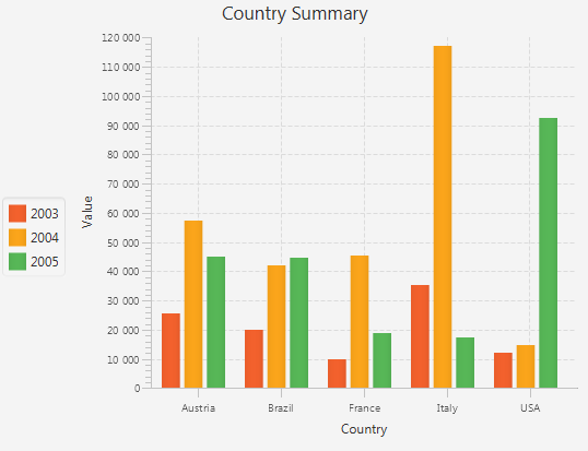
The following is the list of questions along with the answers provided by the GPT-4V model for the above chart.
Answer: The chart type is a bar chart.
Expected Answer: Bar
Question 1: What is the title of the chart?
Answer: The title of the chart is “Country Summary.”
Expected Answer: Country Summary
Question 2: What is the value for Austria for the year 2004?
Answer: The value for Austria for the year 2004 is approximately 30,000.
Expected Answer: 57000
Question 3: What is the value for Brazil for the year 2003?
Answer: The value for Brazil for the year 2003 is approximately 15,000.
Expected Answer: 20000
Question 4: What is the value for France for the year 2004?
Answer: The value for France for the year 2004 is approximately 40,000.
Expected Answer: 46000
Question 5: Which color represents the year 2003?
Answer: The color representing the year 2003 is orange, as indicated by the chart legend.
Expected Answer: Red
Question 6: Which country has highest value for the year 2004?
Answer: Italy has the highest value for the year 2004, with a value just under 110,000.
Expected Answer: Italy
Question 7: For the country USA is the value for the year 2005 more than the year 2004?
Answer: The answer is yes; the value for 2005 is higher than for 2004. The bar for 2005 (green) is taller than that for 2004 (red) for the USA.
Expected Answer: Yes
Question 8: What is the label or title of the X axis?
Answer: The label or title of the X axis is “Country.”
Expected Answer: Country
Question 9: Which country has highest value for year 2005?
Answer: USA has the highest value for the year 2005, with a value just over 40,000.
Expected Answer: USA
Question 10: What is the value for France for the year 2005?
Answer: The value for France for the year 2005 is not visible on the chart due to the nature of the image provided; the bar for France in 2005 is obscured by the bar for Italy in 2004. Without an exact scale or the portion of the graph that includes France’s value for 2005, it’s impossible
Expected Answer: 19000
It’s noticeable that the model attempted to offer approximate answers that were comparatively close to the expected ones, at least better than the answers provided by the Transformers’ models.
2) Testing a Chart from ChartQA Dataset (Good)
Following that, I utilized a chart selected from the ChartQA dataset, which was used in training Transformers models to respond to questions about charts. This dataset was created with human-written questions emphasizing visual and logical reasoning.
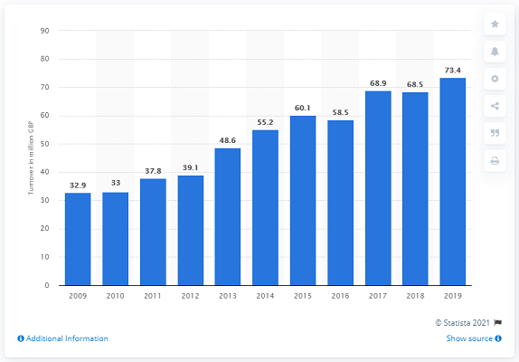
Answer 0: This is a vertical bar chart.
Expected Answer: Bar
Question 1: What is label or title on Y-axis?
Answer: The label or title on the Y-axis is “Turnover in million ▒”.
Expected Answer: Turnover in million GBP
Question 2: Are all the bars in the chart or graph vertical?
Answer: Yes, all the bars in the chart are vertical.
Expected Answer: Yes
Question 3: What is the value of the largest bar in the chart?
Answer: The value of the largest bar in the chart is for the year 2019, with a value of 73.4 million ▒.
Expected Answer: 73.4
Question 4: What is the value for the year 2018?
Answer: The value for the year 2018 is 68.5 million ▒.
Expected Answer: 68.5
Question 5: What is the value for the year 2016?
Answer: The value for the year 2016 is 60.1 million ▒.
Expected Answer: 58.5
Question 6: What is the turnover for the year 2010?
Answer: The turnover for the year 2010 is 33 million ▒.
Expected Answer: 33
Question 7: For which year is the turnover highest?
Answer: The turnover is highest for the year 2019.
Expected Answer: 2019
Question 8: Is the turnover for the year 2017 more than the year 2016?
Answer: The turnover for the year 2017, which is 58.5 million ▒, is less than the year 2016, which is 60.1 million ▒.
Expected Answer: Yes
Question 9: What is the color of the bars in the chart?
Answer: The color of the bars in the chart is blue.
Expected Answer: Blue
In this case, we can note that the model was able to answer most of the questions accurately. The presence of data points on the chart helped in enabling the model to make more precise assessments.
3) Test with Self-Created Chart (Unsatisfactory)
Next, I used with the chart that I personally created. For creating the chart, I used Apache ECharts and picked the data from ourworldindata.org.
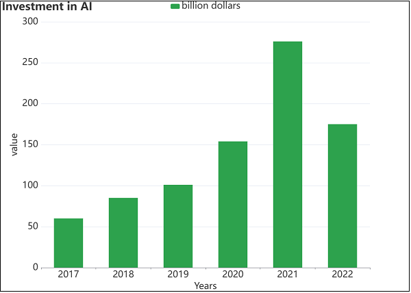
Question 1: What is the title of the chart?
Answer: The title of the chart is “Investment in AI.”
Expected Answer: Investment in AI
Question 2: What is the chart type?
Answer: The chart type is a vertical bar chart (also known as a column chart).
Expected Answer: Bar chart
Question 3: What is the investment in AI for the year 2022?
Answer: The investment in AI for the year 2022 cannot be determined precisely from the image provided, as there are no specific values attributed to the bars. However, it appears to be between 150 and 200 billion dollars based on the chart.
Expected Answer: 175 billion dollars
Question 4: What is the investment in the year 2018?
Answer: Similarly, the investment for the year 2018 cannot be exactly determined from the image, but it is closer to 50 billion dollars as per the scale provided in the chart.
Expected Answer: 85 billion dollars
Question 5: What is the value for the year 2017?
Answer: The investment for the year 2017 is the smallest bar on the chart and, like the others, its value cannot be determined precisely from the image.
Expected Answer:: 60 billion dollars
Question 6: What colors are the bars in the chart?
Answer: The colors of the bars in the chart are different shades of green.
Expected Answer: Green
Question 7: For which year is the investment highest?
Answer: The investment is highest for the year 2021.
Expected Answer: 2021
Question 8: Is the value for the year 2020 more than the year 2019?
Answer: The value for the year 2020 does appear to be more than the value for the year 2019.
Expected Answer: Yes
Question 9: What is the label or title on the X-axis?
Answer: The label or title on the X-axis is “Years.”
Expected Answer: Years
Question 10: What is the label or title on the Y-axis?
Answer: The label or title on the Y-axis is “Value.”
Expected Answer: value
Question 11: What is the value represented by the smallest bar in the chart?
Answer: The value represented by the smallest bar in the chart is for the year 2017, which is also the lowest value but cannot be determined exactly from the image.
Expected Answer: 60 billion dollars
Question 12: What does the legend represent or display?
Answer: There is no legend representing or displaying different categories or series as the bars all seem to be the same color representing the same category ▒ investment in AI as mentioned in billions of dollars.
Expected Answer: billion dollars
Question 13: What is the percentage increase from year 2020 to year 2021
Answer: The percentage increase from the year 2020 to year 2021 cannot be determined.
Expected Answer: 13.6 percentage
From the model’s answers, we can observe that the model was able to answer basic questions about the chart like type, title, labels on axes etc. But when it came to specific numerical values such as amounts for the years, the model encountered challenges. This can be attributed due to the lack of precise data points on the chart as noted earlier.
4) Test with enhanced self-created chart plotted with data markers (Good)
Following that, I tested the chart that I enhanced by plotting the data points.
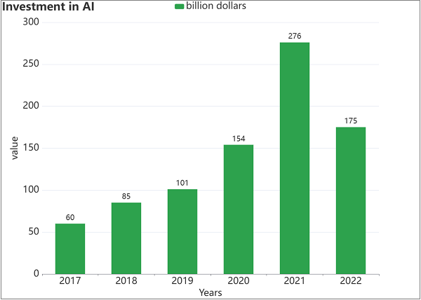
Answer: Title of the chart: “Investment in AI”
Expected Answer: Investment in AI
Question 2: What is the chart type?
Answer: Chart type: Bar chart
Expected Answer: Bar chart
Question 3: What is the investment in AI for the year 2022?
Answer: Investment in AI for the year 2022: 175 billion dollars
Expected Answer: 175 billion dollars
Question 4: What is the investment in the year 2018?
Answer: Investment in the year 2018: 85 billion dollars
Expected Answer: 85 billion dollars
Question 5: What is the value for the year 2017?
Answer: Value for the year 2017: 60 billion dollars
Expected Answer: 60 billion dollars
Question 6: What colors are the bars in the chart?
Answer: Colors of the bars in the chart: Green
Expected Answer: Green
Question 7: For which year is the investment highest?
Answer: Year with the highest investment: 2021
Expected Answer: 2021
Question 8: Is the value for the year 2020 more than the year 2019?
Answer: Comparison of value for years 2020 and 2019: Yes, the value for the year 2020 (154 billion dollars) is more than the year 2019 (101 billion dollars).
Expected Answer: Yes
Question 9: What is the label or title on the X-axis?
Answer: Label/title on the X-axis: “Years”
Expected Answer: Years
Question 10: What is the label or title on the Y-axis?
Answer: Label/title on the Y-axis: “Value”
Expected Answer: value
Question 11: What is the value represented by the smallest bar in the chart?
Answer: Value represented by the smallest bar in the chart: 60 billion dollars for the year 2017
Expected Answer: 60 billion dollars
Question 12: What does the legend represent or display?
Answer: What the legend represents or displays: The legend is indicating that the bars represent “billion dollars.”
Expected Answer: billion dollars
Question 13: What is the percentage increase from year 2020 to year 2021
Answer: Percentage increase from year 2020 to year 2021: Calculating the percentage increase: ((276 – 154) / 154) * 100 = 79.22% (approximately 79%)
Expected Answer: 79 percentage
Question 14: Are there are 6 bars on the chart?
Answer: Whether there are 6 bars on the chart: Yes, there are 6 bars on the chart.
Expected Answer: Yes
Question 15: Are all the bars on the chart vertical?
Answer: Whether all the bars on the chart are vertical: Yes, all the bars on the chart are vertical.
Expected Answer: Yes
Similar to before, the model demonstrated enhanced performance when presented with a chart featuring data markers. It was now able to answer the numerical questions (like investment in AI for various years) well. It was also able to answer inference questions such as percentage increase between years.
Conclusion
When using GPT 3.5-turbo model, I quickly gave up on using ChatGPT and moved to using Transformers. Using Transformers models meant a more complex testing stack. However, the experimentation with GPT-4 Vision model for testing charts using Visual Question Answering approach showed promise. So, I am in a position to simplify my testing tech stack. This suggests a potential application in quality assurance for visual data interpretation. As we continue to refine methodologies, the integration of LLMs in chart testing emerges as a valuable tool for ensuring accuracy, reliability and efficiency in diverse data analysis scenarios.
Hire Qxf2
Qxf2 is your choice for testing because we combine cutting-edge tools, including AI, with a team of skilled testers. We go beyond traditional methods to ensure your software is thoroughly tested, providing you with confidence in its quality and reliability. Get in touch with us!
I have been in the IT industry from 9 years. I worked as a curriculum validation engineer at Oracle for the past 5 years validating various courses on products developed by them. Before Oracle, I worked at TCS as a Manual tester. I like testing – its diverse, challenging, and satisfying in the sense that we can help improve the quality of software and provide better user experience. I also wanted to try my hand at writing and got an opportunity at Qxf2 as a Content Writer before transitioning to a full time QA Engineer role. I love doing DIY crafts, reading books and spending time with my daughter.